Project information
- Category: UX Case Study
- Sub category: User Research
OneNote's Integration of Nielsen & Molich's Ten UI Design Guidelines
In the 1990s, Jakob Nielsen, a renowned web usability consultant, and Rolf Molich, another prominent usability expert, created a list of ten guidelines for user interface design. In this case study, I investigated how "OneNote" a digital note-taking application developed by Microsoft integrates Nielsen and Molich's ten User Interface design guidelines.
1. Visibility of System Status
-
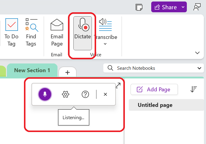
OneNote does an excellent job of informing the user of what is going on with the program by visually showing the user what his actions have led to as much as possible. Users are informed clearly that the microphone is active for listening when using the 'dictate' feature in OneNote, and the icon is modified to indicate this process.
2. System Match to the Real World
-
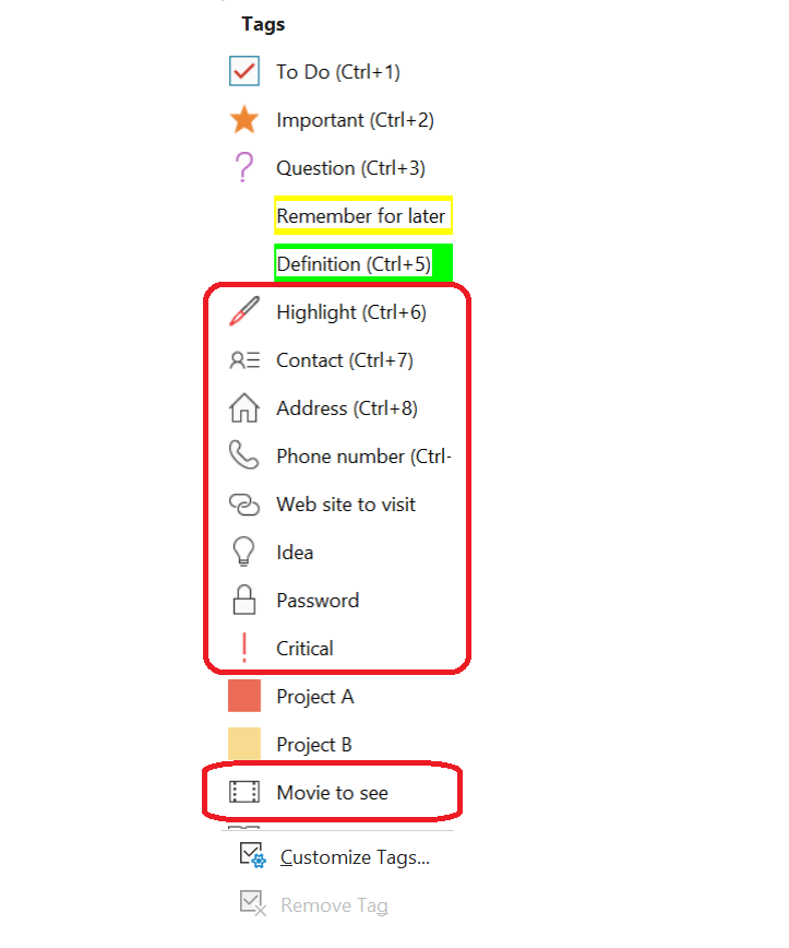
OneNote emulates the real world in terms and representations that their target users would understand, is where they conceive the structure of information and terminology to reflect the same wording we would use in the real world. The tags feature displays similar terms and icons for items like contacts, phone numbers, and passwords. Users find this representation to be beneficial when using the application.
3. User Control and Freedom
-
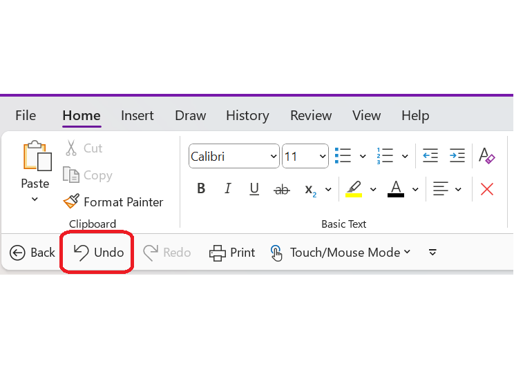
OneNote gives users complete control throughout the process. As users work through their documents, they can easily and quickly step back with the Undo option in the toolbar.
4. Consistency and Standards
-
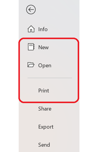
When it comes to the menu bar, OneNote maintains a standard layout and look and feel. Common terms such as 'New', 'Open', 'Print', etc. are also utilized by OneNote.
5. Error Prevention
-
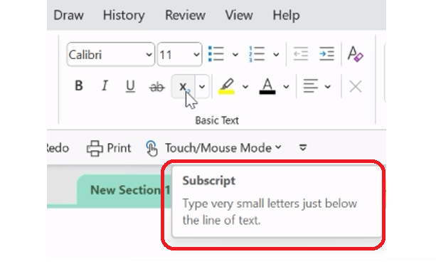
In order to prevent users from making errors, a brief description or label is provided when a user hovers over the tools in OneNote to ensure that users use the appropriate tool for their task.
6. Recognition rather than Recall
-
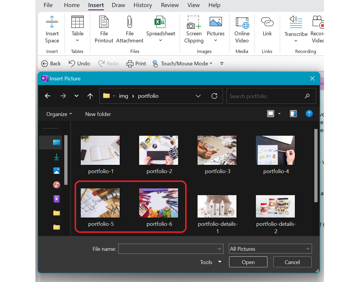
OneNote provides an example view so that users can do the right thing. Instead of having to remember the name or type it in to search for it, the user can visualize what they're looking for by using this. For example, while opening a new image file in OneNote, users are able to visually recognize the image by its thumbnail and select it.
7. Flexibility and Efficiency of Use
-
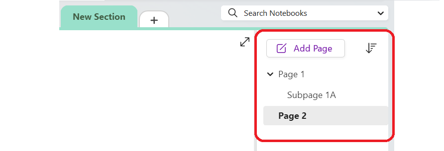
Users can take advantage of its flexibility by arranging and adding new sections and pages to their Notebook and to make things more effective by retaining them for future use.
8. Aesthetic and Minimalist Design
-
In OneNote, the toolbar only displays sections and the options are grouped inside each section to keep clutter to a minimum and maintain a minimalist aesthetic.

9. Help Users Recognize, Diagnose and Recover from Errors
-
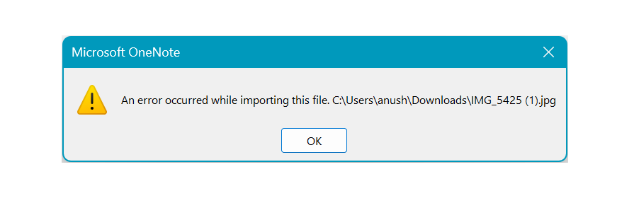
OneNote offers a dialogue when there is an error to inform the user of what went wrong and how to fix it.
10. Help and documentation
-
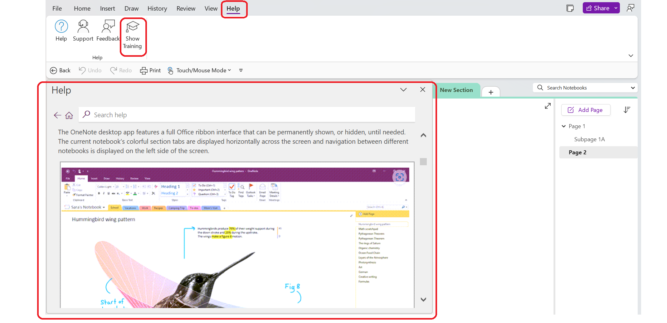
The toolbar provides easy access to help and documentation. From here, users can find a wide variety of help topics and tutorials about how to make complete use of OneNote.
Images are subject to copyright. All Rights Reserved to Microsoft Corporation.
Copyright terms and licence: Fair Use
